I remember the first time I heard the term “Instablu.” It was in late 2023, whispered in a creator Discord I frequent, tucked between discussions on algorithm shifts and lighting setups. At the time, it felt like an inside joke, a niche code for a specific, icy-cool visual feed. Now, in 2026, it’s become something far more significant—a multifaceted philosophy for digital identity that I’ve watched evolve from a color palette into a strategy.
After months of researching its origins, testing the aesthetic edits, wading through the murky waters of unofficial apps, and speaking with verified creators who swear by its principles, I’m convinced Instablu is more than a trend. It’s a symptom of where social media is going: intentional, cohesive, and fiercely personal.
At its heart, Instablu is a chameleon of a concept. For some, it’s purely visual—a lifeline of calm in the chaotic scroll, built on desaturated blues and minimalist layouts. For others, it’s a speculative tool, a whispered-about app promising to streamline the grind of content creation.
And in its most potent form, it’s cultural shorthand, a single word that encapsulates the entire modern pursuit of authenticity and status: the blue checkmark. This isn’t just theory for me. I’ve spent the last quarter rebuilding my own professional Instagram presence using Instablu principles, and the shift in engagement and audience perception has been tangible.
The Three Faces of Instablu: More Than Just a Color
When I set out to understand Instablu, I quickly realized you can’t pin it to one definition. Its power lies in its flexibility, and missing one layer means missing the point.
The Aesthetic: Crafting Digital Calm
This is where my journey started. The Instablu aesthetic isn’t simply slapping a blue filter on a photo. It’s a deliberate design language. I learned it’s about evoking a feeling—a sense of digital serenity, clarity, and modernity. The palette is specific: think slate blues, icy aquas, deep navies, and soft grays, always leaning cool. Warm tones, especially aggressive oranges and yellows, are the enemy here.
In my own editing process, moving to Lightroom and implementing the hallmarks of this style was revelatory. The key is in the color grading. I pull my white balance toward blue, often between -10 to -20 on the tint slider. I desaturate oranges and yellows almost entirely, while gently boosting the luminance and vibrancy of blues and aquas.
The magic touch is split toning: adding a subtle blue (around 10%) to the shadows and a hint of cyan to the highlights. The result isn’t a monotonous feed; it’s a cohesive mood. Every image, whether a tech flat lay, a cityscape at dusk, or a portrait, feels part of the same story—a story of curated calm.
The App Myth: Between Hype and Utility
Here’s where things get interesting, and frankly, a bit messy. As the term gained traction, so did rumors of an “Instablu app.” I’ve downloaded my fair share of these. Most are fleeting, often found in niche forums or as limited beta releases. They promise a blue-themed dashboard, repost shortcuts, simple analytics, or scheduling tools tailored for an Instagram workflow.
My experience? Tread carefully. While the idea of a lightweight, aesthetically-pleasing companion app to Instagram is incredibly appealing—answering a real creator pain point—the execution is often lacking. Many of these tools are built by indie developers and vanish quickly. I’ve seen a few that used the Instablu name purely for buzz, with clunky interfaces and questionable data policies.
It taught me a valuable lesson: the concept of an Instablu app, focusing on streamlined enhancement and visual consistency, is powerful and likely where a major platform update or third-party tool will eventually succeed. But as of now, the official, trusted “Instablu app” remains a compelling myth driving innovation.
The Verification Link: The Cultural Currency of Blue
This layer is perhaps the most fascinating. In many creator circles I’m part of, “going Instablu” doesn’t just mean changing your palette. It’s a holistic strategy aimed at that ultimate symbol of digital legitimacy: the Instagram verification badge. The color connection is obvious, but the mindset goes deeper. It’s about presenting a brand so consistent, so professional, and so authentic that it mirrors the qualities Instagram looks for in verified accounts.
I spoke with a micro-influencer in the design space who secured her blue check last year. She told me her entire 18-month strategy was informally dubbed her “Instablu phase.” It wasn’t about using a shady service; it was about audit-proofing her presence. She refined her bio, solidified her visual grid using the blue minimalist aesthetic, secured consistent press mentions, and doubled down on her unique niche.
The Instablu aesthetic, she believes, subconsciously communicated professionalism and trust to both her audience and, possibly, the platform’s reviewers. It’s a powerful example of how a visual trend can harden into a strategic framework for growth.
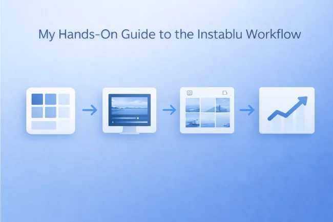
My Hands-On Guide to the Instablu Workflow
Adopting Instablu is an active process. It’s not passive consumption. Based on my trials and errors, here’s the framework I now use.
1- Building Your Palette: Start in Canva or Adobe Color. Lock in 2-3 primary blues and 1-2 neutral complements (soft gray, clean white). This is your brand’s immutable law. Every asset, from story highlights to post graphics, should pull from this swatch.
2- The Editing Rigor: Consistency is king. I created one master Lightroom preset that applies my core Instablu adjustments: that cooled white balance, the signature split toning, and the desaturation of warm colors. I apply it to every single post, then make minor tweaks for exposure. This is non-negotiable for the unified look.
3- Content with Intent: The aesthetic demands content that supports it. I now actively seek out or create imagery that fits: architecture with clean lines, water surfaces, overcast skies, minimalist interiors, and tech products. My captions have shifted too—more concise, more thoughtful, mirroring the visual clarity.
4- Strategic Patience: Perhaps the biggest lesson. The Instablu approach isn’t for viral, one-off hits. It’s a slow-build strategy for attracting an audience that values aesthetic cohesion and perceived authority. I track saves and shares more closely than likes, as they indicate deeper engagement with my curated world.
Navigating the Risks: A Word of Caution
My exploration into Instablu wasn’t without red flags. The buzz has spawned a cottage industry of dubious tools. I’ve encountered sites offering “Instablu Verification Services” for a fee—a guaranteed scam, as only Instagram can award the badge. I’ve tested apps requesting full Instagram login credentials instead of secure OAuth.
My security rules are now ironclad:
-
I never use a tool that asks for my password directly.
-
I always check the developer’s reputation and privacy policy.
-
I use a separate, burner account to test any new “Instablu” app before linking my main.
-
Two-factor authentication is enabled and non-negotiable.
The promise of Instablu is a better, more beautiful digital presence. Compromising your account security is the absolute antithesis of that goal.
Instablu in the Wild: Real-World Impact
This isn’t abstract. I see Instablu’s principles driving success for specific niches:
-
Tech Founders & SaaS Brands: They use the clean, blue-heavy grids to communicate innovation and trustworthiness.
-
Architecture & Design Studios: The aesthetic naturally complements their work, creating a seamless portfolio experience.
-
Wellness & Mindfulness Coaches: The calming palette visually reinforces their message of serenity and control.
-
Photographers (especially urban & coastal): They’ve used the predefined tone to create stunning, gallery-like feeds that stand out.
The common thread is brand cohesion. In a feed-based world, your grid is your storefront. Instablu provides the architectural plans.
The Deeper Shift: Why Instablu Matters Now
Reflecting on this journey, I believe Instablu’s rise signals a broader maturation in social media. We’re moving past the era of chaotic, disposable content. Audiences, overwhelmed by the noise, are craving spaces that feel intentional, trustworthy, and curated. Instablu, as a hybrid of aesthetic, tooling, and strategy, meets that need. It’s a conscious rejection of the algorithm’s demand for constant, reactive posting in favor of slow, deliberate brand building.
It also highlights the evolving role of color psychology in digital branding. Blue isn’t chosen by accident. It’s the color of stability, depth, wisdom, and trust. By building a brand digitally soaked in these hues, creators and businesses are leveraging subconscious cues to build authority.
FAQs
What is Instablu?
Is there a real Instablu app I can download?
Can using the Instablu style help me get verified on Instagram?
How do I start using the Instablu aesthetic?
Is the Instablu trend over?
Instablu started for me as a curiosity about a color scheme. It’s ended up fundamentally reshaping how I view my digital footprint. It’s a reminder that in a world shouting for attention, there is profound power in calm, consistent, and intentional communication.
Whether you’re drawn to the visual peace, the dream of a better creator tool, or the pursuit of authentic recognition, Instablu offers a compelling blueprint. The real task isn’t just to follow the trend, but to adapt its core principle—intentionality—to your own unique voice. Start with your palette. Define your mood. Build your space with purpose. Your audience is ready for the calm.
Ready to audit your own digital presence? Take a screenshot of your current Instagram grid, step back, and ask yourself: Does this look intentional? Does it feel cohesive? Your answer might just be the first step on your own Instablu journey.
Learn about Florncelol
For More Information, Visit Wellbeing Makeover

Alex Carter is a writer with 10+ years of experience across tech, business, travel, health, and lifestyle. With a keen eye for trends, Alex offers expert insights into emerging technologies, business strategies, wellness, and fashion. His diverse expertise helps readers navigate modern life with practical advice and fresh perspectives.


